From dial-up modems to AI coding
Web design has evolved significantly over the years, maturing to a state of solid principles and standards. It’s also grown in its creativity and dynamics, allowing us to bring to life ideas and concepts well beyond where it humbly started a few decades ago.
It has been a fascinating journey to get here. Our guides, EPIC COO Tim Merath and Art Director Nick Swenor, will walk us through a history of everything that’s changed, and offer a nostalgic glimpse at the good (or not-so-good) ol’ days.

THE CERN WEBSITE—THE BIRTHPLACE OF THE WORLD WIDE WEB AND AN EXAMPLE OF THE PINNACLE OF WEB DESIGN CAPABILITIES IN THE MID-1990S.
A trip back to the ’90s with our guide Tim
Though the internet existed before the 1990s, the World Wide Web and “websites” didn’t exist until 1991. Any concept of design would take years to take hold. It was utilitarian, without the ability to truly engage in any real design. Sure, every website had a “user interface” of some kind, but there wasn’t much room for flexibility or creativity.
For much of the 1990s, the World Wide Web didn’t present a very diverse canvas to work on. When I started building websites in 1994, I did it on a 28.8 Kbps dial-up modem, silly connection sounds and all. There weren’t millions of sites at this time—there were thousands. The vast majority of sites were mostly or completely text-based and simple. Animated GIFs were small but considered cutting-edge. It was groundbreaking when you’d see actual interface elements like headers, buttons, or any sort of framing.
As I learned to build for more commercial interests, including an online supplements store for my father, there was more to consider from a user perspective. Instead of just doing whatever was possible and fun, I had to think about the user journey and experience within the limited tools we had available. It was during this time that table-based layouts took off, allowing us to structure the page into a true interface beyond just a top-down approach.
As simple and restricting as tables were, they were a massive turning point in web design. Before this point, since there wasn’t much to “design”—most time was spent spitting out HTML code. Tables with invisible borders and spacing provided a framework for design to really take hold. It was in the late 90s that this really took off and the age of web design really began.
As web design matured during the remainder of the 90s, it was all about experimentation. Not as playful and frivolous as earlier in the decade when we just did something because we could. It was more about pushing the limits of the technology and getting creative with image files and code. At this point, we could use GIFs with transparency to create overlays between foreground elements and background images. Non-rectangular shapes could be faked. Buttons and image frames became a possibility. True styles and brands could be represented in a way that, while still far off from what you could get in printed applications, was familiar and engaging.
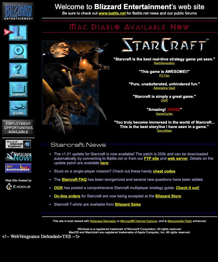
BLIZZARD DIDN’T JUST HAVE AMAZING GAMES—STARCRAFT OCCUPIED AN UNHEALTHY AMOUNT OF NERDY, TEENAGE TIM’S TIME—BUT REALLY PUSHED THE ENVELOPE WITH THEIR SITES. LOOK AT THOSE BUTTONS!

LOOK MA, BRANDING! APPLE STILL SETS THE BAR FOR WEB DESIGN. THEY MADE QUITE THE LEAP FROM 1996 TO 1998.
As we raced towards the new millennium—and away from the Y2K apocalypse—creativity had taken hold. Web design was making its own way separate from programming, and the word “art” could start to be used when looking at websites. We saw site headers and navigation become commonplace beyond just text links. Not every site had a black or white background. There was DESIGN, and lots of it. In the context of the time, some really impressive design, at that.
It would still be years before table-based design would be buried, but technology was growing, new tools and capabilities were being invented each year, and it was finally time to take down that animated “Under Construction” GIF… more than likely of a cartoon character with a jackhammer.
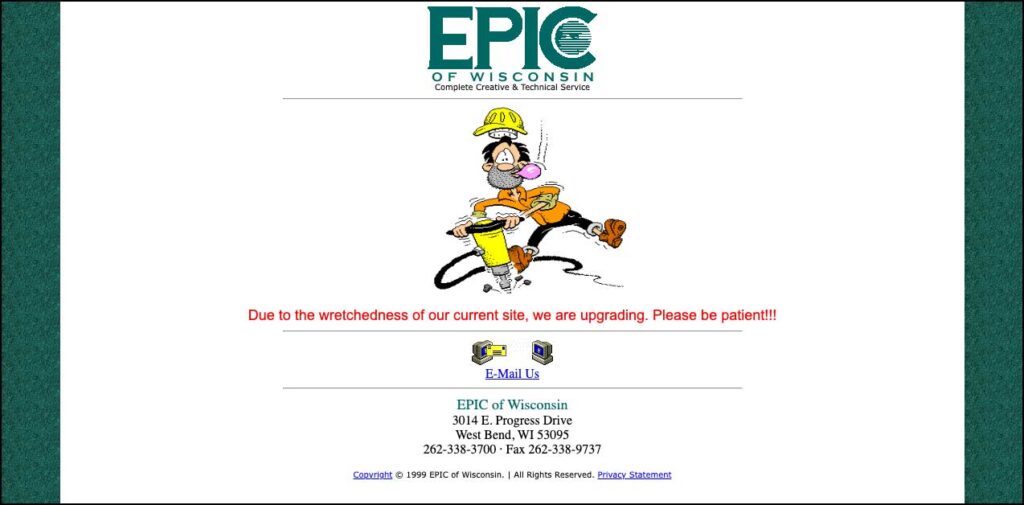
THE EPIC WEBSITE AS IT WAS FROM 1999 TO 2001, WHEN TIM TOOK OVER ITS REDESIGN.
2000s to today, with our guide Nick
What did the internet look like in the early 2000s? How soon we forget! Depending on the year, social media was nonexistent, Facebook was in its infancy, and/or Myspace was on its way out. In addition, the iPhone hadn’t been released, so responsive design for viewing on mobile wasn’t something young designers or developers were taking into consideration.
In addition, companies were still printing catalogs, magazine subscriptions were as strong as ever, and colleges were still sending out informational packets with a DVD to visually explain why this was the college for you (including my alma mater, Northern Michigan University).

(NORTHERN MICHIGAN UNIVERSITY, 2006 → 2023)
In 2006, college courses on web design were still teaching students how to build a website by chopping up a Photoshop file and using html/css to make it functional. Flash was a tool that allowed for a more “unique experience” through animation and dropping in a bit of code, which most of us have since forgotten with the introduction of HTML5 and the iPhone. (You may remember the notification bar requiring “the Macromedia Flash Player” before hackers and Flash’s CPU-intensive performance got the best of it.)
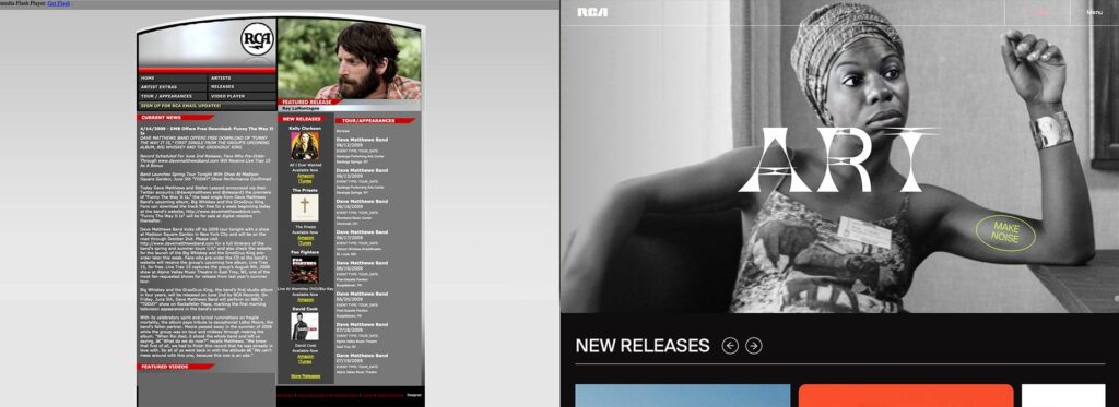
(RCA, 2009 → 2023)
E-commerce sites had also begun to slowly emerge throughout the early 2000s, but even by 2009 they were still developed using either a “fixed” or “liquid” layout. The term “Responsive Design” was coined just a few years after in 2010 to describe how design adapts to various screen sizes, and by 2012 it was a widely discussed trend. I can vaguely remember a time when it was pitched as a unique add-on to win a web project and today it’s simply the standard way we design for all sites.
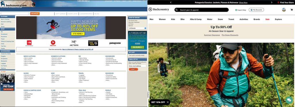
(BACKCOUNTRY.COM, 2010 → 2023)
Rise of themes and content management
Open-source Content Management Systems (CMS) like Drupal, Joomla, and WordPress began to emerge in the early 2000s and by 2012, the platform was a designer’s best friend with the introduction of themes. Themes essentially allow designers to create a website with little to no knowledge of HTML/CSS. And for developers, they offer enhanced customization to cater to a variety of needs.
As technology and design trends continue to evolve and change, content management systems will adapt to meet the demands of the user. For example, in 2021 WordPress introduced custom blocks with its Gutenberg Block Editor. As the future unfolds, it’s likely the platform will continue to optimize performance within the robust ecosystem of plugins and themes. Artificial intelligence (AI), too, will probably find its way to integrate itself.
What does the future hold?
Of course, there are undoubtedly a lot of future advances that we’re not yet aware of. But, as we have done since 1994, the EPIC team will continue to invest in staying on top of all the innovations logically and methodically, making sure we bring our clients the best web build possible.
Stay tuned for part 2 of this series, which will dive deeper into EPIC’s approach to the user experience.

